Y-Fitness |UI Design|
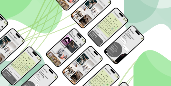
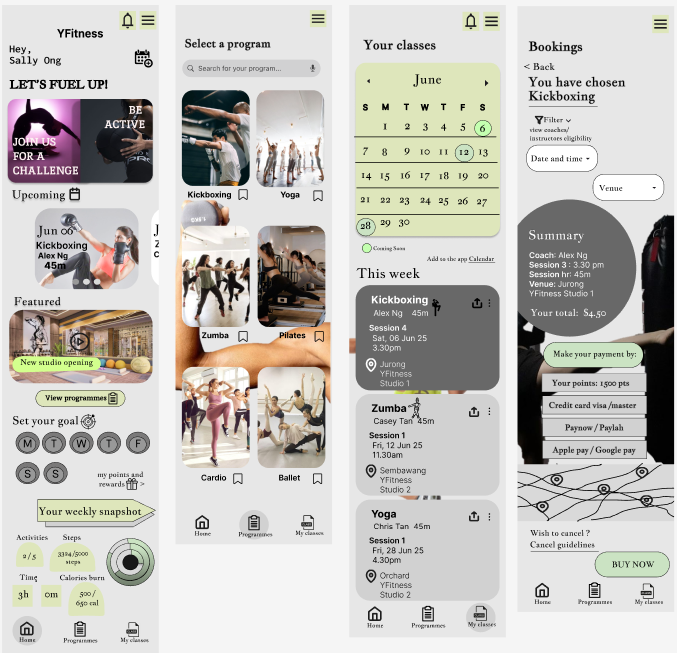
An app interface designed to book fitness classes from Kickboxing, Yoga to Zumba for youths aged 18-30.
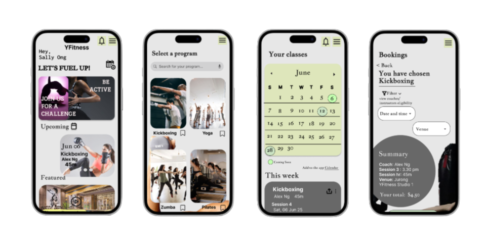
Key User Task
To view booked programs, such as the date, time, and studio venue.
To browse, filter, and search programs and their details.
To register for a program class.
Design process
I decided to use the 60-30-10 rule with the colours light grey, dark grey, and sage green. (60-light grey, 30-sage green, 10-dark grey). The purpose of using these colours is to support a calm, minimalistic and clean feel.
Sage green was incorporated to evoke associations with health, energy, and personal growth, aligning with the app’s focus on fitness and well-being.
I use widgets and rounded curve edges in my design to fit the current design trend of modern, minimalistic user interfaces that prioritise clarity and visual comfort.
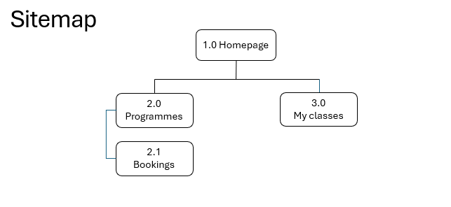
A sitemap is being built as part of the information architecture, serving as a guideline for the wireframe along with the wire flow. This helps map out key user processes.
Wireframe
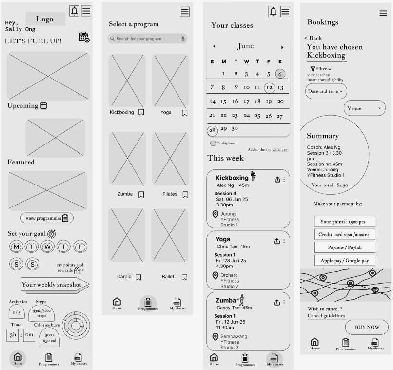
Final design screens
Reflections
In this UI design, I focused on designing a fitness application that allows users to easily browse programmes, book and view classes as the main goal. I used a simple bottom navigation structure with ‘Home’, ‘Programmes’, and ‘My Classes’ to help users move between screens efficiently. The interface uses card-based layouts and clear sections to improve visual hierarchy and make information easier to process.
One challenge I faced was keeping the amount of information displayed balanced, organised and uncluttered.
Through this project, I learned the importance of structuring content clearly and prioritising key user tasks. In future iterations, I would refine the visual consistency and conduct usability testing to further improve user’s experience.
Link to prototype: https://www.figma.com/proto/YV...